Google Cloud Platform
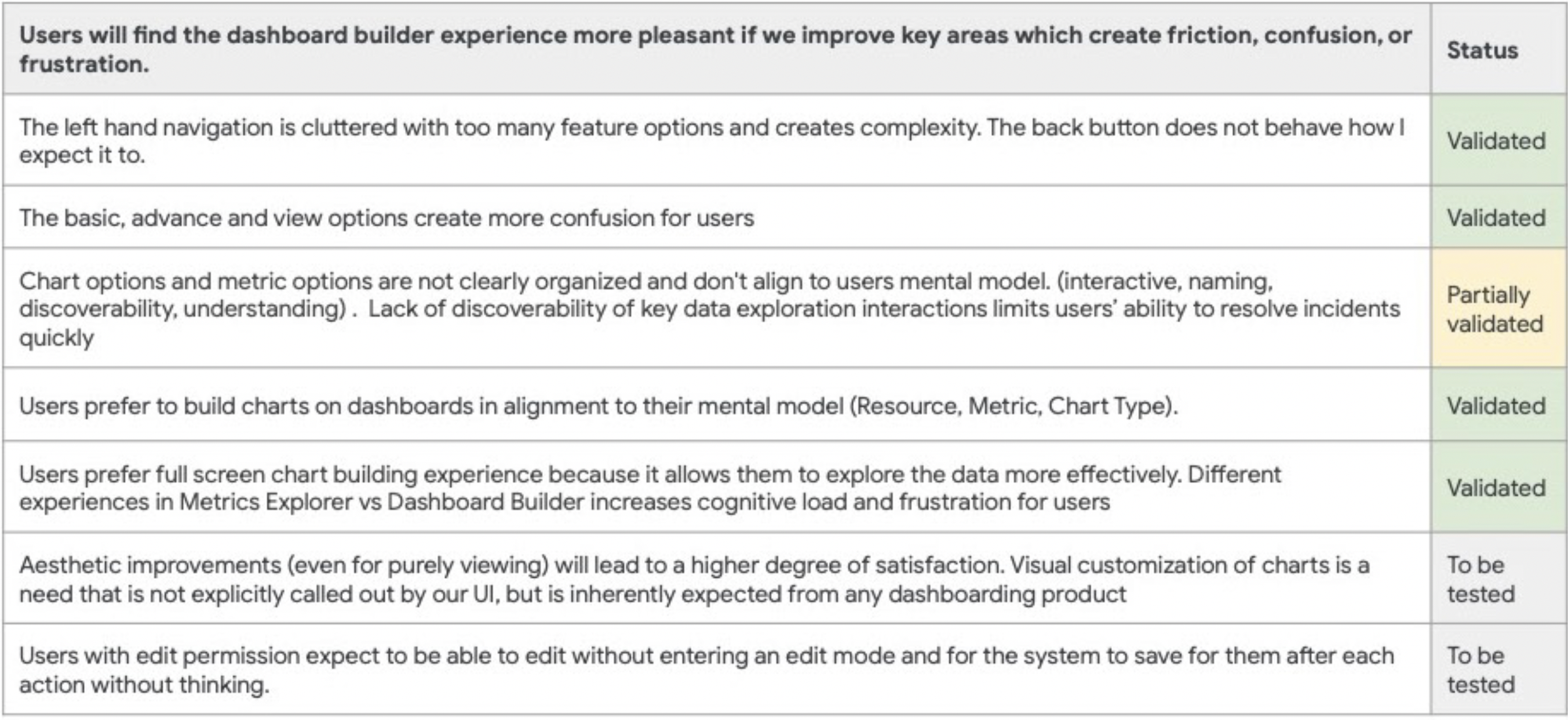
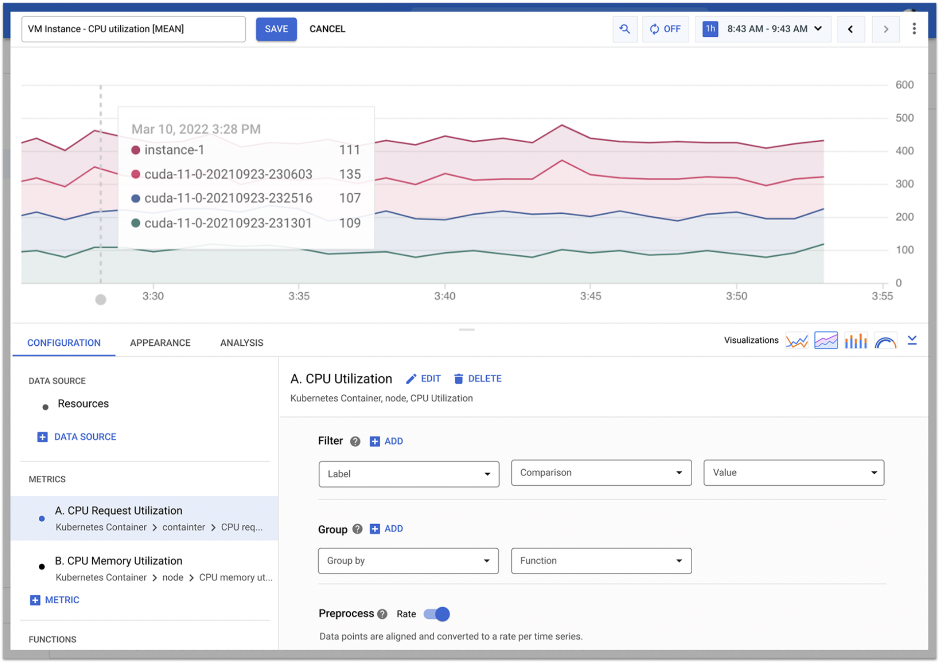
The Google Cloud monitoring product serves a wide variety of personas ranging from highly technical coders to lower-tech analysts. The product needs to be rich with features that are customizable yet easy to use. Since new feature additions had grown rapidly, several UX conventions needed a holistic overhaul, lifting multiple dependent features at once, the existing interface configures source data, charts, and dashboards simultaneously, creating layers of complexity.
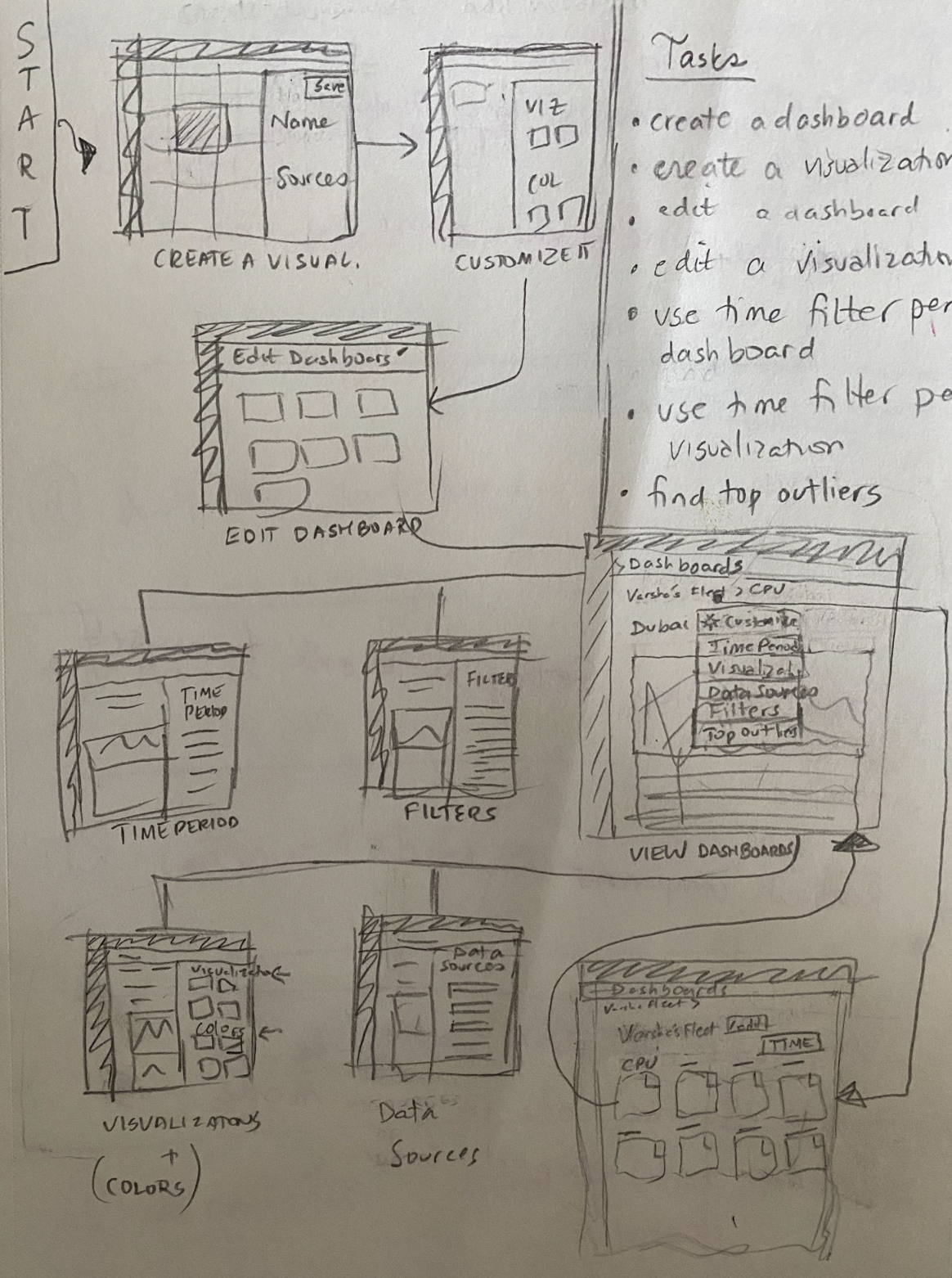
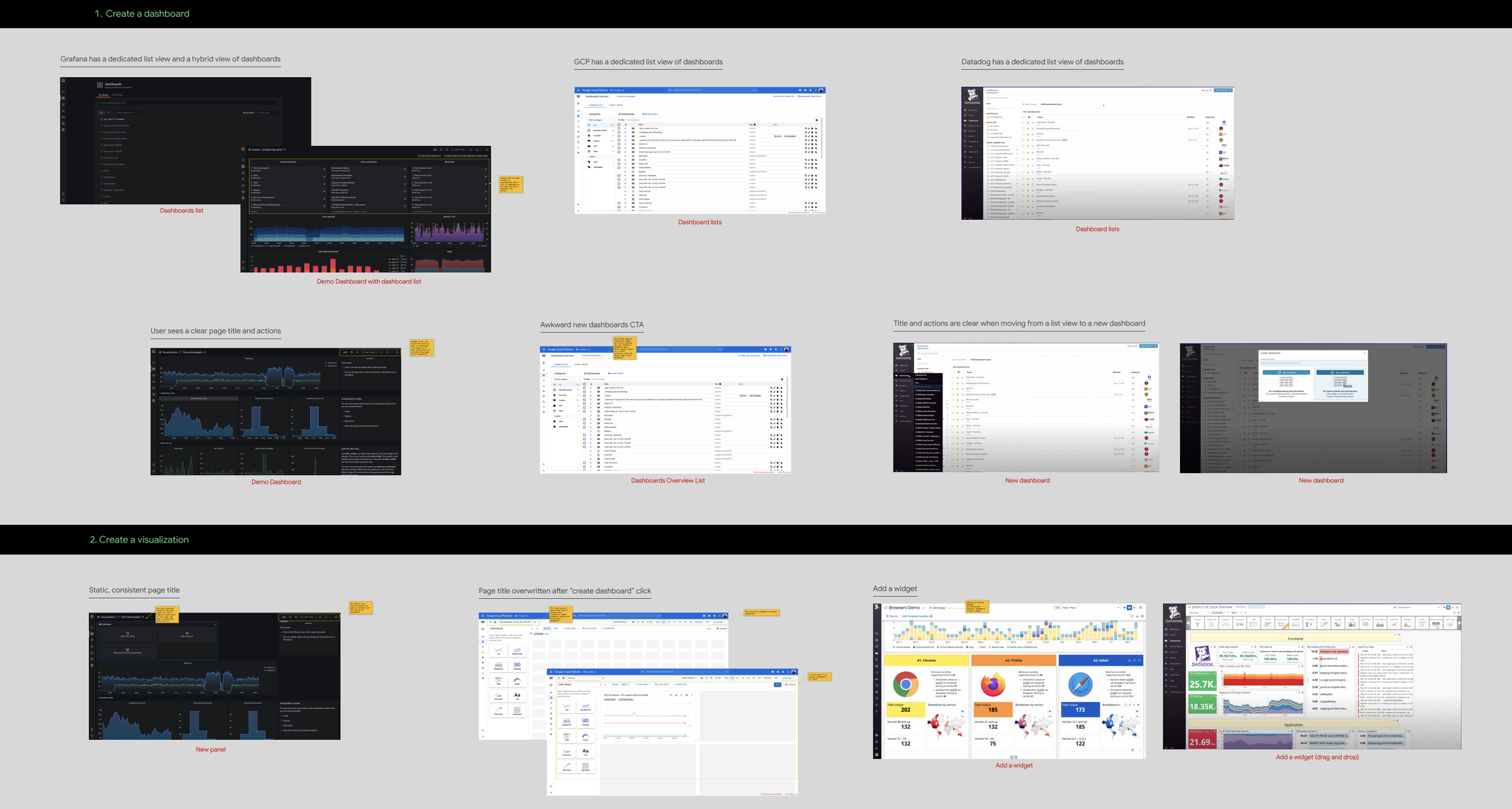
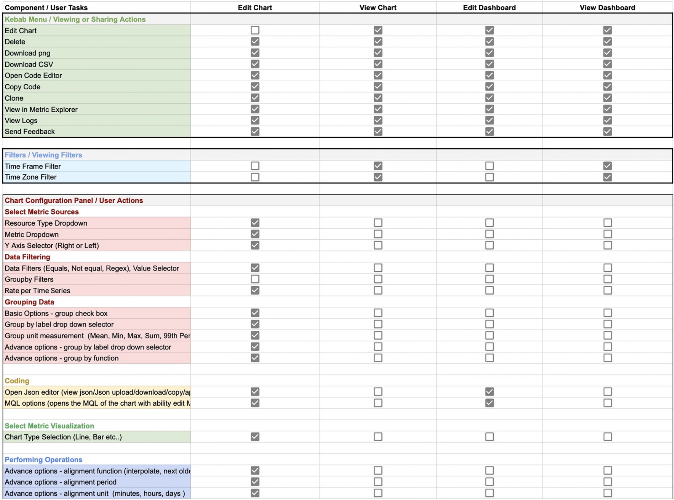
We started with competitive research, combing through the microinteractions in Grafana and Datadog, focusing on chart creation and visualization since that area needed the greatest overhaul. Working hand in hand with user research, we mapped the mental model for configuring a new chart and built feature information-architecture clusters to keep component types consistent and easy to find.
Challenge
Process
Outcome
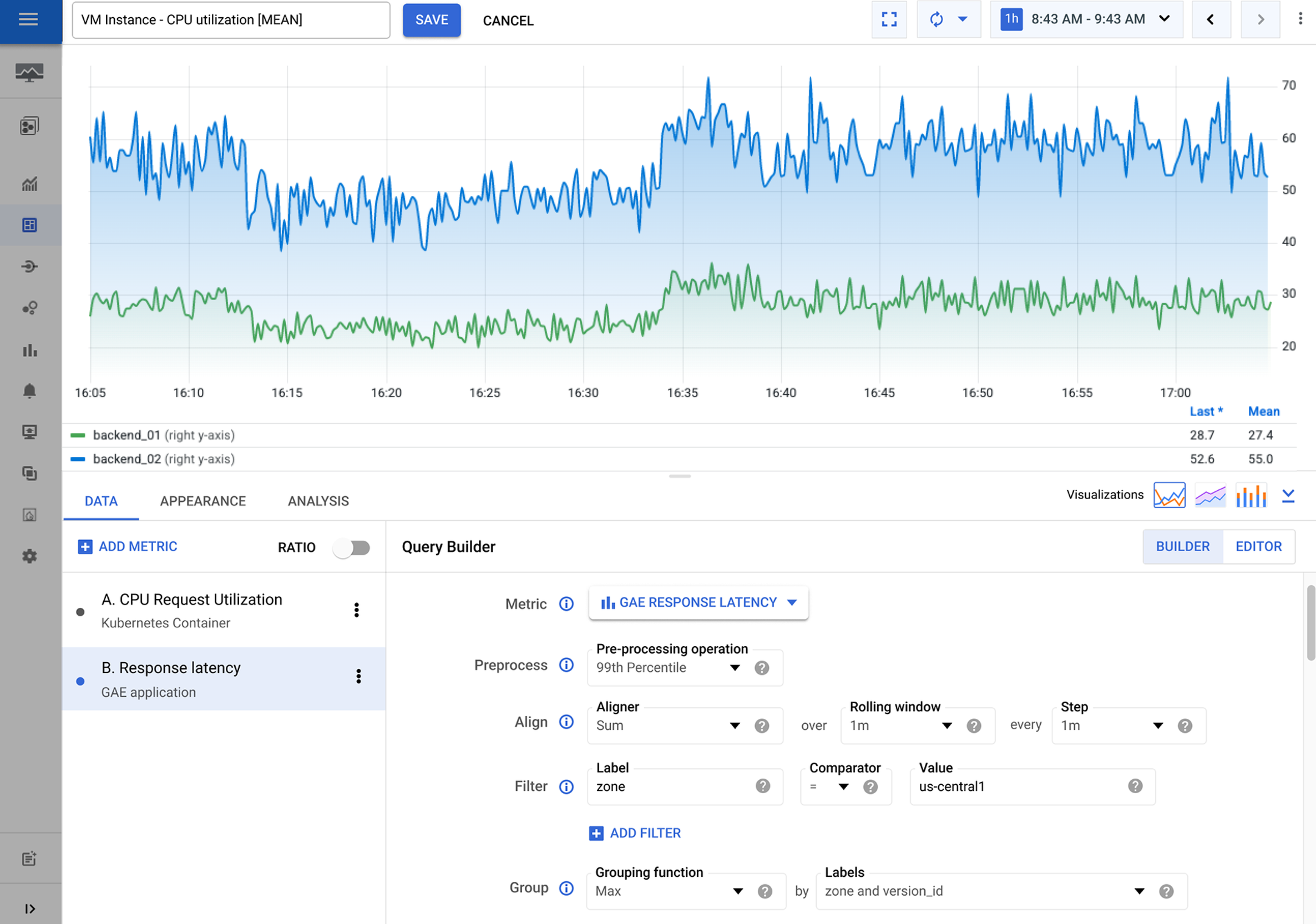
Redesigned monitoring dashboard